library(nhanespewas)
con <- connect_pewas_data()

# For each phenotype-exposure pair:
result <- pe_flex_adjust(
  phenotype = "LBXTC",     # e.g., total cholesterol
  exposure = "LBXBPB",     # e.g., blood lead
  adjustment_model = adjustment_models[[9]],  # full model
  con = con
)

# Meta-analyze across waves with UWLS
meta <- stanley_meta(
  estimates = per_wave_estimates,
  standard_errors = per_wave_ses
)Module 8: Putting It All Together — An Atlas of the Exposome
Conducting Exposome-Wide Association Studies
Chirag J Patel
Overview
This module walks through a large-scale ExWAS that applies everything from Modules 1-8:
Patel CJ, Ioannidis JPA, Manrai AK. An atlas of exposome-phenome associations in health and disease risk. Nature Medicine, in press.
- 619 exposures \(\times\) 305 phenotypes \(\times\) 10 NHANES waves
- ~120,000 associations tested
- Built using the
nhanespewasR package you learned in Modules 4-7
From Course to Practice
| Module | Concept | How It Was Used |
|---|---|---|
| 1 | Exposome definition, NHANES | 10 NHANES waves, 1999-2018 |
| 2 | Tidyverse pipelines | Data wrangling at scale |
| 3 | Survey design, FDR, scaling | svyglm, Bonferroni + BY-FDR |
| 4 | nhanespewas package | Core analysis engine |
| 5 | ExWAS loop | 120K associations with tryCatch |
| 6 | Volcano plots, replication | Atlas visualization, 10-wave replication |
| 7 | Meta-analysis, interactions | UWLS meta-analysis across waves |
The P-ExWAS: Study Design at a Glance
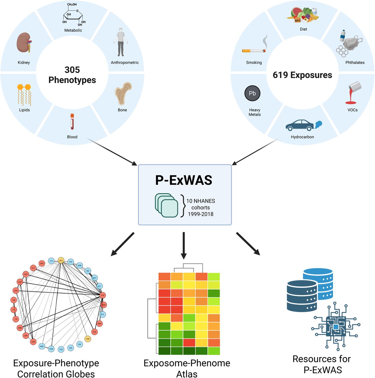
Figure 1: The P-ExWAS study design. 305 phenotypes and 619 exposures across 10 NHANES cohorts (1999-2018) are combined into the Exposome-Phenome Atlas, correlation globes, and open-source computational resources.
The P-ExWAS Analytical Pipeline
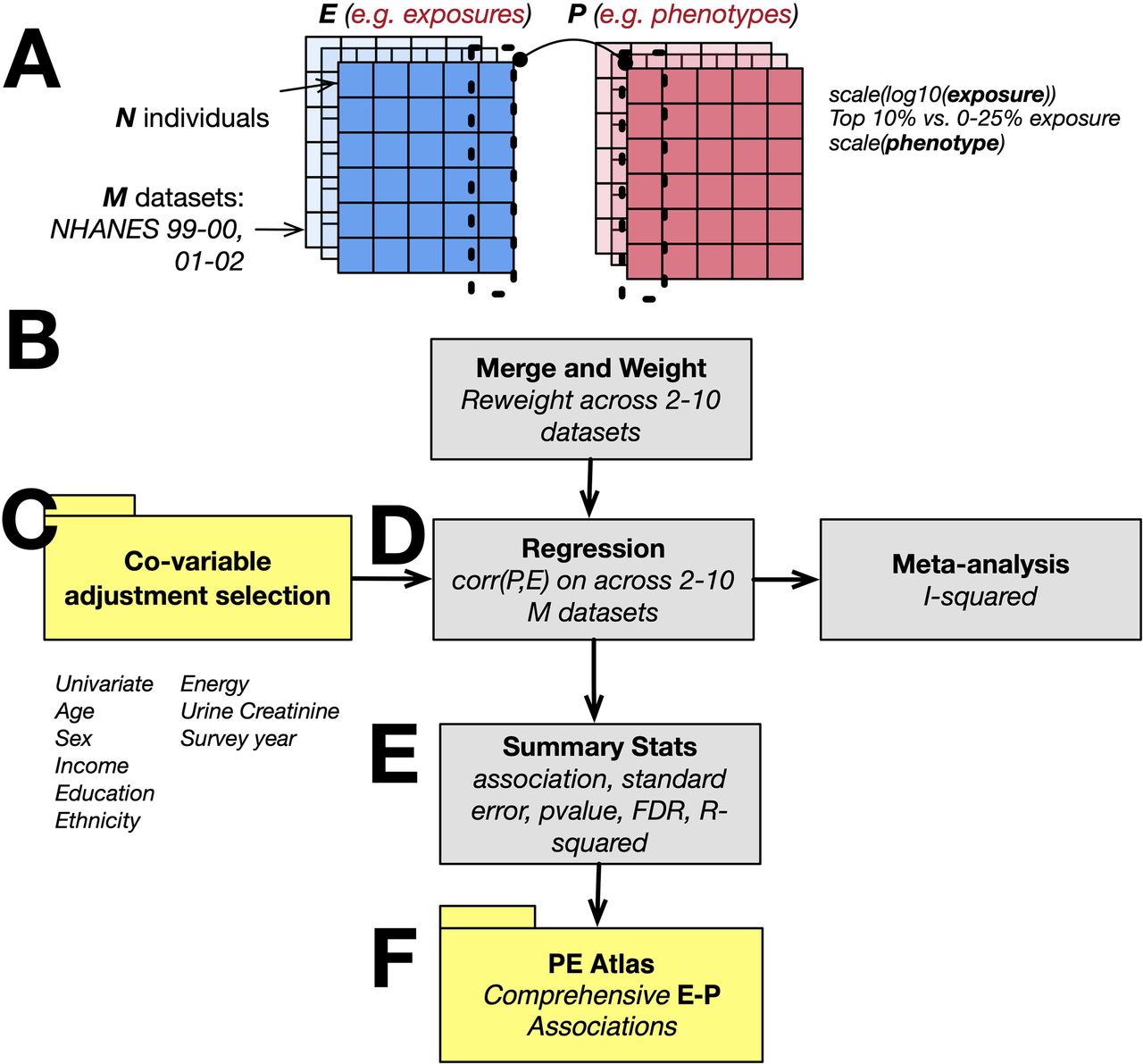
Figure 6: The P-ExWAS pipeline. (A) Exposure and phenotype matrices across M NHANES datasets. (B) Merge and reweight across 2-10 datasets. (C) Nine covariate adjustment models. (D) Survey-weighted regression and meta-analysis. (E) Summary statistics. (F) The PE Atlas.
Scale of the Analysis
| Metric | Value |
|---|---|
| Total possible associations | 563,627 |
| After filtering (\(n \geq 500\), \(\geq 2\) waves) | 119,643 |
| Unique phenotypes | 305 |
| Unique exposures | 619 |
| NHANES waves | 10 (1999-2018) |
| Median sample size per test | 7,464 (IQR 4,220-15,316) |
This is ExWAS at an unprecedented scale — and all of it powered by the nhanespewas package.
The nhanespewas Pipeline (Recap)
The atlas was built using exactly the tools from Modules 4-5:
Exposure Transformation
Consistent with Module 3, all continuous exposures were:
- Log₁₀-transformed (not natural log) to handle right-skew
- Standardized to mean = 0, SD = 1 within each wave
- Values below the lower limit of detection (LLOD): set to LLOD/\(\sqrt{2}\)
Phenotypes were also scaled to enable cross-phenotype comparison.
Interpretation: each coefficient (\(\beta\)) represents the SD change in phenotype per 1 SD change in log₁₀(exposure).
The Full Adjustment Model
The primary model (Model 9 of 9) adjusted for:
\[P = \beta_0 + \beta_1 E + \gamma_1 \text{age} + \gamma_2 \text{age}^2 + \gamma_3 \text{sex} + \gamma_4 \text{income} + \gamma_5 \text{ethnicity} + \gamma_6 \text{education} + \gamma_7 \text{wave} + \epsilon\]
Nine adjustment models were tested (Module 4’s adjustment_models framework), from unadjusted to fully adjusted — enabling sensitivity analysis.
Sensitivity to Adjustment
15% of significant findings showed a sign reversal between the unadjusted and fully adjusted models.
Example: Blood cadmium and BMI
- Unadjusted: positive association (cadmium ↑ → BMI ↑)
- Fully adjusted: negative association (cadmium ↑ → BMI ↓)
This highlights why confounder adjustment matters (Module 3) — and why running multiple adjustment models (Module 4) is essential.
Meta-Analysis Across 10 Waves
The UWLS meta-analytic method (Module 7) pooled estimates across NHANES waves:
Heterogeneity (I²) assessed stability across time:
| Waves available | Median I² |
|---|---|
| 2 | 0% |
| 5 | 26% |
| 10 | 18% |
Most associations are consistent over time; some show temporal trends.
Multiple Testing Correction
With ~120,000 tests, stringent correction is essential:
| Method | Threshold | Significant |
|---|---|---|
| Bonferroni | \(p < 4 \times 10^{-7}\) | 5,674 (5%) |
| Benjamini-Yekutieli FDR | \(p < 5.1 \times 10^{-4}\) | 15,386 (12%) |
The BY-FDR (more conservative than BH-FDR) was used because exposures are correlated — standard BH-FDR assumes independence.
The Associational Architecture of the Exposome
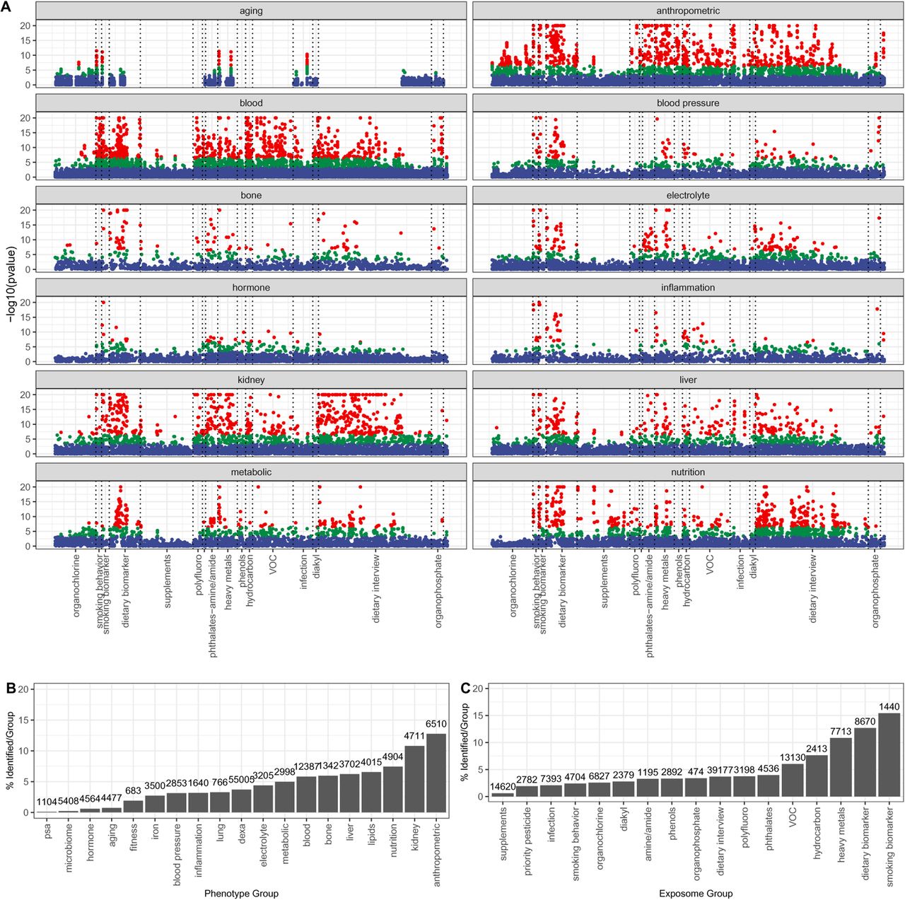
Figure 2: Manhattan-style plots of -log10(p-value) by phenotype category (red = Bonferroni, green = FDR, blue = NS). Right panels show % significant associations by phenotype and exposure group.
Reading the Manhattan Plots
Key patterns in Figure 2:
- Anthropometric phenotypes (BMI, waist circumference): dense red clouds across nearly all exposure categories
- Metabolic phenotypes (glucose, HbA1c): strong hits in smoking, dietary biomarkers, heavy metals
- Kidney phenotypes: prominent associations with heavy metals (lead, cadmium, mercury)
- Inflammation (CRP): broad associations across pollutants and nutrients
- Microbiome: fewest associations — a frontier for future research
Which Phenotypes Had the Most Associations?
Top phenotypes by % of tests reaching Bonferroni significance:
| Phenotype | % Significant | Tests |
|---|---|---|
| Serum bilirubin | ~20% | 640+ |
| Waist circumference | ~20% | 640+ |
| BMI | ~20% | 640+ |
| Triglycerides | High | 640+ |
| HbA1c | High | 640+ |
Cardiometabolic and anthropometric phenotypes dominate — consistent with the ExWAS literature (Module 1).
Variance Explained by the Exposome
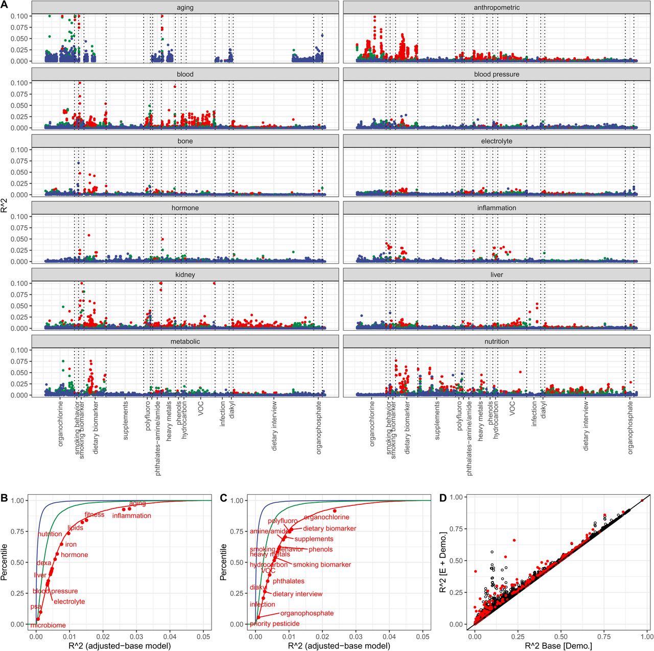
Figure 3: (A) R-squared by exposure-phenotype pair. (B-C) Cumulative R-squared by phenotype and exposure category. (D) Base demographic model R-squared vs. expanded model with exposures — points above diagonal show exposures contribute beyond demographics.
Variance Explained: Key Numbers
Individual exposures explain modest variance, but collectively they add up:
| Model | Median R² |
|---|---|
| Single exposure (Bonferroni-significant) | 0.6% (IQR 0.3%-1%) |
| ≤20 exposures | 1.6% (IQR 0.7%-3.5%) |
| Top 20 exposures | 3.5% (IQR 1.8%-7.9%) |
| Maximum (triglycerides) | 43% |
| Non-significant (single exposure) | 0.02% |
Most individual effects are small — but the cumulative signal is substantial.
The Exposome-Phenome Atlas
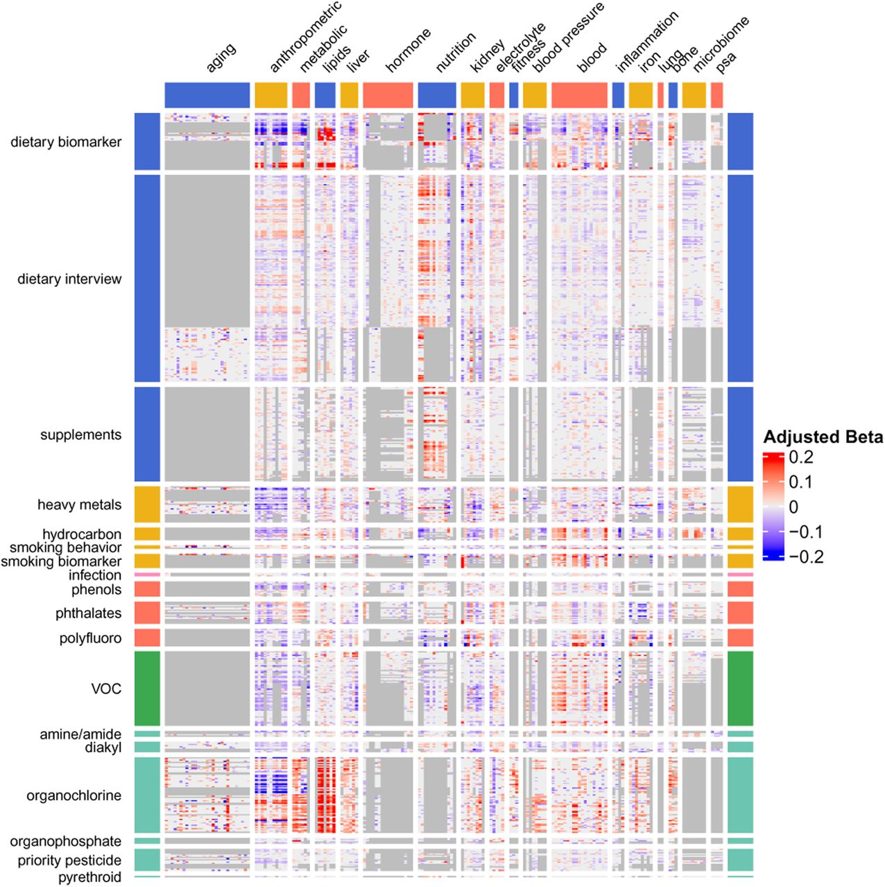
Figure 4: The full PE Atlas. Each cell = adjusted beta for one exposure-phenotype pair, meta-analyzed across NHANES waves. Rows = 619 exposures; Columns = 305 phenotypes. Red = positive, blue = negative, grey = insufficient data.
Reading the Atlas Heatmap
Key patterns in Figure 4:
- Dietary biomarkers (top rows): widespread associations across anthropometric, metabolic, and lipid phenotypes
- Smoking biomarkers: strong block of associations with blood parameters, pulmonary function, and inflammation
- Heavy metals: concentrated associations with kidney function and blood parameters
- Organochlorines (bottom): associations with lipids and aging phenotypes — these persistent pollutants accumulate in lipid compartments
- Grey regions: data sparsity — not all exposures are measured in all waves
Triglycerides: The Headline Finding
Triglycerides emerged as the phenotype most strongly associated with multi-domain exposures.
Poly-exposure R² = 43% (20 exposures simultaneously)
Top contributors:
| Exposure | Direction | Category |
|---|---|---|
| Trans,trans-9,12-octadecadienoic acid | + | Trans fatty acid |
| Alpha-tocopherol | + | Vitamin E |
| Gamma-tocopherol | + | Vitamin E |
| Persistent organochlorines | + | Lipophilic pollutants |
Trans fats and lipophilic pollutants accumulate in the same lipid compartment as triglycerides.
BMI: Exposome vs. Genome
For BMI, the study compared exposomic and genomic variance explained:
| Source | R² | Method |
|---|---|---|
| Genetics (UK Biobank PGS) | ~10% | Polygenic score (~1M variants) |
| Exposome (top 20 exposures) | ~10% | Poly-exposure score |
The exposome explains as much BMI variation as the genome.
This is a landmark finding — it quantifies the often-hypothesized parity between genetic and environmental contributions.
Exposome vs. Genome: Across Phenotypes
Across 29 phenotypes with both genetic and exposomic data:
- Median genetic R²: 7.9% (IQR 2.8%-9.3%)
- Median exposomic R²: 7.9% (IQR 3.1%-12%)
- 55% of phenotypes (16/29) had higher exposomic than genetic R²
For triglycerides: exposomic R² (43%) far exceeded genetic R² (~8%).
The exposome is not a minor contributor — it is a major axis of phenotypic variation.
Effect Sizes
For Bonferroni-significant associations, standardized effect sizes (\(\beta\)):
- 5th-95th percentile: \(-0.17\) to \(0.19\)
- Absolute median: ~0.06 SD per SD of exposure
These are small but real effects — consistent with the expectation that individual environmental factors make modest contributions to complex traits.
Tobacco and Lung Function
A methodologically important finding comparing two smoking biomarkers:
| Biomarker | Half-life | \(\beta\) on FEV1 | R² |
|---|---|---|---|
| Urinary NNAL | 10-16 days | \(-0.06\) | 0.20% |
| Serum cotinine | ~16 hours | \(-0.03\) | 0.08% |
NNAL (a tobacco-specific carcinogen metabolite) is a better marker than cotinine because its longer half-life captures cumulative exposure rather than recent smoking.
Lesson: Biomarker choice matters — measurement error attenuates associations (Module 3).
Biomarkers vs. Self-Report
The atlas compared objective biomarkers vs. self-reported dietary intake:
| Measurement | Bonferroni associations | Median R² |
|---|---|---|
| Dietary biomarkers (blood/urine) | 1,101 | 1.0% |
| Self-reported nutrients | 1,452 | 0.2% |
Biomarkers yield 5\(\times\) larger R² despite fewer significant associations — because they have less measurement error.
Day-to-day self-reported nutrient correlation: \(r = 0.36\) — highlighting instability.
Exposure Correlation Globes
Figure 5: Exposure correlation structure. (A) Correlation globe for 50 exposures — dense connections among heavy metals, PCBs, and smoking biomarkers. (B) Correlations among exposures associated with BMI and HbA1c. (C) Cumulative distribution of pairwise exposure correlations.
Reading the Correlation Globes
Key patterns in Figure 5:
- Red nodes and blue nodes represent different exposure categories
- Thick dark lines: strong correlations (\(|r| > 0.25\))
- Heavy metals form a tightly connected cluster (shared environmental sources)
- Smoking biomarkers (cotinine, NNAL, PAHs) are highly interconnected
- Lipophilic pollutants (PCBs, organochlorines) co-accumulate in adipose tissue
- The dense web means exposures rarely act in isolation — complicating causal attribution
Exposure Correlation: By the Numbers
- 200,265 pairwise correlations assessed
- Among Bonferroni-significant pairs: median \(|r| = 0.21\)
- 95th percentile: \(|r| = 0.69\)
Examples of high correlation:
| Exposure Pair | \(r\) | Reason |
|---|---|---|
| Cotinine vs. 3-fluorene (PAH) | 0.90 | Both from tobacco smoke |
| Trans- vs. cis-beta-carotene | 0.98 | Same dietary sources |
| Blood vs. urinary cadmium | 0.78 | Same metal, different matrices |
Replication Across NHANES Waves
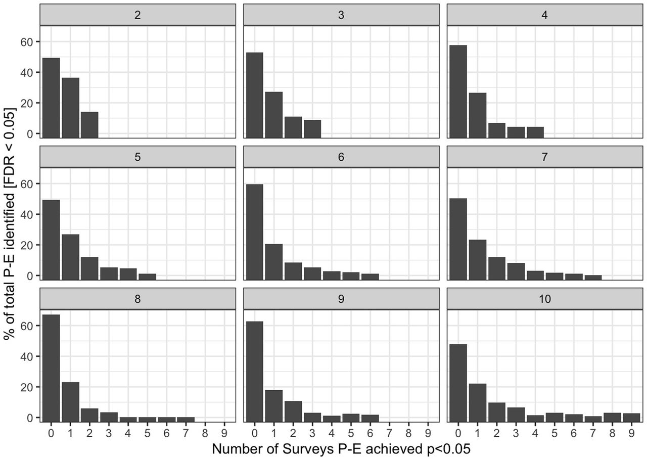
Figure 7: Replication rates across NHANES waves. Each facet shows associations available in K waves (2-10). X-axis: number of waves achieving p < 0.05. Y-axis: % of FDR-significant associations.
Replication: Key Numbers
| Category | Replication Rate |
|---|---|
| Bonferroni-significant | 41% replicated in \(\geq 2\) waves |
| Assessed in all 10 waves | 13% replicated in all 10 |
| Non-significant (baseline) | 0.8% |
Replication rate far exceeds the chance expectation — these are real signals.
The faceted bar charts show that as more waves are available, the distribution of replication counts shifts rightward — robust findings survive across decades of independent sampling.
Shared Associational Architecture
Some exposure pairs associate with phenotypes in strikingly similar ways:
| Exposure Pair | Correlation of phenotype profiles |
|---|---|
| Blood trans- vs. cis-beta-carotene | \(r = 0.98\) |
| Cotinine vs. 3-fluorene | \(r = 0.90\) |
| BMI vs. body weight | \(r = 0.98\) (phenotypes) |
| BMI vs. cardiorespiratory fitness | \(r = -0.83\) |
| HbA1c vs. HDL cholesterol | \(r = -0.54\) |
Exposures from the same category tend to have similar phenotype profiles — but cross-category similarities also exist, revealing shared biology.
Poly-Exposure Score Construction
The poly-exposure score (analogous to a polygenic score) was built as follows:
- Select top 20 FDR-significant exposures for each phenotype (univariate)
- Impute missing data with MICE (10 imputations)
- Fit baseline model: phenotype \(\sim\) demographics
- Fit expanded model: phenotype \(\sim\) demographics + 20 exposures
- \(\Delta R^2\) = expanded \(R^2\) - baseline \(R^2\)
Reproducing Key Findings with nhanespewas
You can reproduce these results using the tools from this course:
library(nhanespewas)
con <- connect_pewas_data()

# Run the triglycerides ExWAS
trig_results <- map_dfr(e_catalog$var, function(exp_var) {
  tryCatch({
    result <- pe_flex_adjust("LBXTR", exp_var,
                             adjustment_models[[9]], con)
    result %>%
      map_dfr(~ tidy(.), .id = "wave") %>%
      filter(grepl(exp_var, term)) %>%
      summarize(exposure = exp_var,
                estimate = mean(estimate),
                p.value = min(p.value))
  }, error = function(e) NULL)
})

# Apply FDR
trig_results <- trig_results %>%
  mutate(fdr = p.adjust(p.value, method = "BY"))
Meta-Analyzing Across Waves
# For a single exposure-phenotype pair across waves:
result <- pe_flex_adjust("LBXTR", "LBXBPB",
                          adjustment_models[[9]], con)

per_wave <- result %>%
  map_dfr(~ tidy(.), .id = "wave") %>%
  filter(grepl("LBXBPB", term))

# UWLS meta-analysis (as used in the atlas)
meta <- stanley_meta(per_wave$estimate, per_wave$std.error)

# Compare with DerSimonian-Laird
library(metafor)
rma_fit <- rma(yi = per_wave$estimate,
               sei = per_wave$std.error, method = "DL")
Key Lessons from the Atlas
- Scale matters: testing 120K associations reveals patterns invisible in single studies
- Replication is achievable: 41% of Bonferroni hits replicate across independent waves
- Exposome \(\approx\) Genome: poly-exposure scores rival polygenic scores for many traits
- Measurement quality matters: biomarkers >> self-report for R²
- Confounders can flip signs: 15% of associations reverse direction after adjustment
- Exposures are correlated: complicates causal attribution, requires careful interpretation
- Small individual effects, large cumulative signal: median \(\beta \approx 0.06\), but 20 exposures can explain 3.5-43% of variance
Limitations and Open Questions
The atlas authors acknowledge:
- Cross-sectional design: cannot establish temporality or causation
- Correlation \(\neq\) causation: confounding, reverse causation remain
- Missing exposures: NHANES doesn’t measure everything (air pollution, noise, psychosocial stress)
- Single time-point: doesn’t capture exposure trajectories
- US-specific: may not generalize globally
Future directions: longitudinal exposomics, Mendelian randomization, mediation analysis (requires longitudinal data to establish temporality), multi-omics integration (proteomics, metabolomics, methylomics)
Data and Code Availability
All resources are publicly available:
| Resource | Location |
|---|---|
nhanespewas R package |
https://github.com/chiragjp/nhanespewas |
| PE Atlas web tool | https://pe.exposomeatlas.com |
| Full cohort database | doi: 10.6084/m9.figshare.29182196 |
| Summary statistics | doi: 10.6084/m9.figshare.29186171 |
| Tutorials | pe_quickstart.Rmd, exwas_tour.Rmd, pe_catalog.Rmd |
You have all the tools to reproduce, extend, and build on this work.
Your Turn: Exercise Ideas
- Reproduce a finding: Pick a phenotype from the atlas, run the ExWAS with
nhanespewas, and compare your results to the published atlas - New phenotype: Choose a phenotype not in the atlas and run your own ExWAS
- Sensitivity analysis: Compare results across all 9 adjustment models for your top hits
- Meta-analysis: Run per-wave estimates and build forest plots for a replicated finding
- Correlation globe: Visualize the exposure correlation structure for your top hits
Course Summary
| Module | What You Learned |
|---|---|
| 1 | The exposome concept, NHANES, E-G-P-D framework |
| 2 | Tidyverse data manipulation and visualization |
| 3 | Survey-weighted regression, FDR, standardization |
| 4 | The nhanespewas package and database |
| 5 | Building and running the ExWAS loop |
| 6 | Volcano plots, replication, sensitivity analysis |
| 7 | Meta-analysis, interactions, advanced methods |
| 8 | Full-scale application: the Phenome-Exposome Atlas |
The Big Picture
The Patel, Ioannidis, and Manrai atlas demonstrates that:
The exposome is not a minor perturbation on a genetic background — it is a co-equal axis of phenotypic variation, with poly-exposure models matching or exceeding polygenic scores for the majority of tested phenotypes.
With the tools from this course — nhanespewas, survey-weighted regression, FDR, meta-analysis, and the PE Atlas — you are equipped to contribute to this field.
Thank You
Congratulations on completing the course!
The exposome is vast. The tools are ready. The atlas is public.
Now it’s your turn to explore.
Reference:
Patel CJ, Ioannidis JPA, Manrai AK. An atlas of exposome-phenome associations in health and disease risk. Nature Medicine, in press. doi: 10.1101/2025.06.05.25329055
Supported By
This course is supported by the National Institutes of Health (NIH):
- National Institute of Environmental Health Sciences (NIEHS): R01ES032470, U24ES036819
- National Institute of Diabetes and Digestive and Kidney Diseases (NIDDK): R01DK137993